Pages

Sunday, 29 March 2015

Evaluation of Reports

When I first looked at the brief I predicted what topics I would find most interesting and relevant to me. However over the course of several weeks I was surprised at what I did and didn’t find interesting. Now I wished I made more of an effort to attend all lectures, as it was difficult to predict which weeks would have appealed most to me. One of my concerns with the reports is that they often have a limited number of sources. I felt with being limited to 500 words I wouldn’t be able to go into great depth or detail about the subject particularly if there were so many sources to include.

Satire and Protest sparked an interest for me. The idea of exploring and expressing strong and radical opinions really appealed to me, a way of letting out inner thoughts about the world in an acceptable manner. Something I’m gradually looking into. Through research I discovered historical satire is a great way of finding out about politics in history. I felt my responses to satire were successfully as they accurately capture what satire is and its spirit.

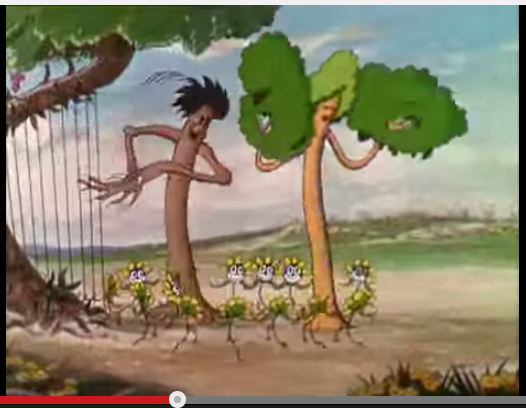
Anthropomorphism was the most relevant to my work as it links in well with current work. Meaning I had a good amount of practical work, at a good standard, to support my report. Because anthropomorphism is so loved by people it made it the easiest to research and I was able to incorporate a good number of sources. The combination of good practical work and a variety of sources helps make the report my strongest. I was also familiar with the subject manner, although I was the most interested in satire, I had very little knowledge and was learning from scratch. Which is why anthropomorphism was the stronger report.

When it came to Graphic Symbols I was less enthusiastic about the other reports but I was intrigued by the effectiveness of its use. Unlike the other reports I had little thoughts and opinions about graphic symbols so I simply responded to the information I gathered. This made it an effective and informative report but not as interesting or as engaging as my other reports.

As a woman, addressing gender is important to me, however I had to be carefully not to get to focused on general feminist issues and keep it relevant to visual culture. One of the things I’m disappointed about with this report was not exploring the concept of beauty and the influence it has on the visual world. I felt limited in what issues I could discuss and I’m not sure if I’ve fully supported them with my research, making it one of my weaker reports.


At first I found it hard to feel inspired or engaged with some of the subjects but as the weeks past I found subjects that interested me and ones I didn’t know I was interested in. I have been inspired by satire, deepened my understanding of anthropomorphism, appreciated graphic symbolism and understood that gender has nothing to do with great characters or art. All in all I’d say the reports have added to my work and my understanding of the visual world.

Gender and Bias in Visual Culture


Fig 1. Captain Hook as a woman
Fig 2. Mrs Smee 
When researching I was drawn to films and how all lead roles are dominated by men. Disney’s Peter Pan although enjoyed by all contains only a handful of female lead characters. So I experimented by drawing Captain Hook and Mr Smee as women. (Fig 1, Fig 2) I’ve maintained similar appearances and characteristics to show that their personalities haven’t changed. The fact that so little has changed, yet the characters still appear to be the same indicates how unnecessary it is that an effective lead role has to be male. In fact it would create a far more interesting dynamic if Hook and Smee were women.

The poor representation of women in the movie industry is highlighted by the Bechdel test. TV Tropes[1] explains the test:

The Bechdel Test, Bechdel-Wallace Test, or the Mo Movie Measure, is a litmus test for female presence in fictional media. In order to pass, the film or show must meet the following criteria:
  1. It includes at least two women,
  2. who have at least one conversation,
  3. about something other than a man or men.1

Three simple requirements, but often films fail the test. However just because a film passes the test doesn’t mean it contains feminist values and just because a film fails the test doesn’t mean it doesn’t have feminist values. As TV Tropes puts it; “(The) problem is that it becomes a pattern when so many movies fail the test, … very few show male characters whose lives seem to revolve around women, that says uncomfortable things about the way Hollywood handles gender.”1

This poor representation of women isn’t just restricted to the film industry but also in the history of art. Ask anyone to name an artist and they can come up with a couple of names; Van Gogh, Picasso, Dali, da Vinci, Michelangelo etc. But ask them to name a female artist and they’ll struggle to do so. In fact on google the suggested list of artists I counted till 32 before they named a female artist, Georgia O'Keeffe. (Fig 3)

Fig 3. Google search
Although it was very appropriate for it to be O'Keeffe, her work celebrates femininity. Her Paintings of flowers often resemble the female form (Fig 4, Fig 5, Fig 6), some even consider them as erotic art. Her explorations of femininity in her work can be summarised in her own words “I feel there is something unexplored about women that only a woman can explore.”[2] I almost feel that’s she bombarding the art world with femininity, as if she feels that it has been dictated for too long what femininity should look like in art. By using flowers to resemble the female form, it’s almost as if she saying this is what it means to be a woman and that’s all there is it to it, the rest is up to the individual.

Fig 4. Red Canna. 1924. Georgia O'Keeffe.
Fig 5. Flower of Life II. 1925. Georgia O'Keeffe.
Fig 6. Oriental Poppies. 1928. Georgia O'Keeffe.


[1] http://tvtropes.org/pmwiki/pmwiki.php/UsefulNotes/TheBechdelTest
[2] www.georgiaokeeffe.net


Bibliography

Georgiaokeeffe.net. 'Georgia O'keeffe Paintings, Biography, And Quotes.'. N.p., 2015. Web. 29 Mar. 2015.
Tvtropes.org. 'The Bechdel Test / Useful Notes - TV Tropes'. N.p., 2015. Web. 29 Mar. 

Saturday, 28 March 2015

Graphic Symbolism and Visual Language

Signs, Symbols and other forms of visual language are a key part of our daily lives and have played a significant part throughout history. The evolution from visual language to written langue occurred due to limitations and restrictions of symbols. A symbol can be misinterpreted or have too many meaning, so over time a written form of communication developed to match the complexities of speech.
Fig 1. Hat Symbols

Fig 2. Assembly of many possible interpretation of a candlestick. Signs and Symbols
When researching I was intrigues by Fig 2 and all the different ways a single object could be represented. I explored a similar path using a hat as my given object (Fig1). This experimentation made me aware of how powerful lines and shapes are in communicating, even a line and a square could represent a hat.

The key to symbols and visual shorthand is familiarity, when looking at figurative symbols. If you’re not aware of an object, and of its basic shape, then you have no hope in understanding what its visual representation means.

A symbol and a Sign are made up of key elements:
  • Dot
  • Line
  • Negative and solid space
  • Colour
  • Relationship between all the above

Colour is key apart of graphic symbols today. It has a powerful role in advertising and road signs. We associate different colours with different feelings and situations. For example red represents; danger, anger and romance. Whereas blue represents; cold and sadness.

Here are some more example of how important a role can play when it comes to designing and symbolising: (taken from designintense.com[1])
  • Traffic lights: Red means stop, yellow means caution, and green means go. Yellow signs also warn drivers of upcoming curves, pedestrian crossings, and animal crossings.
  • Patriotism: Most, if not all countries have a flag. The colours of each flag are usually seen as patriotic. Red, white, and blue symbolizes patriotism in the U.K as well as other countries.
  • Holidays: Red and green are favourite Christmas colours. Black and orange are associated with Halloween. Pastel colours are used for Easter.
  • Emotions: Blue is seen as conservative. Red is power and aggression. Brighter colour such as yellow and orange represent warmth not only with emotions but also with temperature. Cool colours are blue, green, black or any colour with a dark shade.
  • Ecology: Green is the major colour symbolizing ecology. The new phrase for people or companies who find ways to cut back on electricity, fuel, or things that damage the environment is “going green.”
The website also sheds some light on what we associate with different shapes:

Colour is only a part of symbolism of course, the other part is shape/form. Some common shapes and their symbolism in western culture are:
  • circle — feminine (womb), encompassing, whole, nurturing
  • square — order, balance, structure, building block
  • vertical shapes — phallic, masculine, upward motion, rocket
  • horizontal shapes — rest, distance, traveling1

Through a combination of using colour, shape, line and association we have created a sophisticated way of communicating visually that has influenced road signs, advertisement and other signs.


Bibliography

Design Intense. 'Symbolism in Design | Design Intense'. Designintense.com. Web. 28 Mar. 2015.
Frutiger, Adrian. London: Studio Editions, 1989. Print.

[1] http://designintense.com/symbolism-in-design/

Anthropomorphism

Anthropomorphism

Fig 1 Water Colour of taxidermy Turtle
Fig 2. Pencil Sketches
Fig 3. Line drawing of Winston Turtle
Fig 4. Woodcut print of Winston Turtle
There are three main approaches to anthropomorphism; adding human traits to an object, taking a human and adding animal qualities to them or taking an animal and adding human qualities and characteristic to them. In my approach I went with the latter. After drawing a turtle for some time I understood its shape and form well enough to feel confident in using its characteristics and traits to morph them into human attributes. I looked to the taxidermy turtle trying to see what human qualities I felt were already there, and after some brainstorming I felt he had similar qualities to Winston Churchill. I had to be careful with my designs not to over exaggerate attributes as I wanted it to be an endearing tribute to Churchill and not to ridicule; an illustration not satire. By keeping the features simple and refined I felt that this kept the final image endearing yet dignified.

This endearing and charming approach is often seen throughout illustrations, particularly ones “intended” for children. This can best be seen in classic children’s illustrations, such as; Beatrix Potter’s work (Fig 5) and E. H. Shepard’s illustrations in ‘Wind in the Willows’ (Fig 6). Looking through these books I realised what made them so charming was how they selected animals that would match well with human traits and successfully portray personalities. The animals were also likable and at times cute. A good example of matching animal and human characiteristics  would be the weasels in ‘Wind in the Willows who are of course are scoundrels and villains. However sometimes unexpected animals are matched with opposite traits. Dualism was used in ‘The Wizard of Oz’, in the form of a scared lion. 

Fig 5. Beatrix Potter. The Tailor of Gloucester
Fig 6. E. H. Shepard. Wind in the Willows.

There are different ways to anthropomorphise an animal:
  •  Adding an animal head to a human body and vis versa
  • Animals acting like humans; walking on two legs, wearing clothes, language (Fig 4, Fig 5, Fig 6, Fig 7, Fig 8, Fig 9)
Fig 7. Pauline Baynes. The Lion, the Witch and the Wardrobe.
Fig 8. Stephen Collins

Fig 9. Stephen Collins
However anthropomorphism isn't just restricted to animals. Objects and the environment can also reflect human traits and characteristics. Take some of Disney’s early cartoons ‘Micky Mouse through the Mirror’ (Fig 11) made in 1936 brings to life all sorts of characters from armchairs to telephones. And in ‘Silly Symphony; Flowers and Trees’ (Fig 10) a good number of flowers and trees are brought to life and given personalities. 
Fig 10. Walt Disney. Silly Symphony; Flowers and Trees


Fig 11. Walt Design. Micky Mouse through the Mirror 
The purpose of anthropomorphism is to entertain. Whether that be through children’s books, animations, cartoons or satire. It is never intended to be taken seriously; a reflection of the real world and a reflection of the artist’s imagination.

Bibliography

Collins, Stephen. Some Comics by. London: Jonathan Cape, 2014. Print.
Grahame, Kenneth. The Wind in the Willows. London: Methuen Children's Books Ltd, 1908. Print.
Lewis, C. S. The Complete Chronicles of Narnia. London: Geoffrey Bles, 1954. Print.
Potter, Beatrix. The Tailor of Gloucester. Harmondsworth, Middlesex, England: F. Warne, 1987. Print.
YouTube. 'Mickey Mouse Thru The Mirror 1936 Toon'. N.p., 2015. Web. 28 Mar. 2015.
YouTube. 'Silly Symphony - Flowers And Trees'. N.p., 2015. Web. 28 Mar. 2015.

Friday, 27 March 2015

Satire and Political Caricature/Cartoons

Satire and Political Caricature/Cartoons

Fig 1. George Osborn Robbing the Poor and Disabled.
With all political cartoons and satire, they respond to current issues and are relevant to society. This is what I set out to achieve in my practical research. By working on these drawings I realised how aware a political cartoonist must be on current events. I have a slight interest in politics but not enough to fully understand, analyse and respond to current affairs. I feel one of the cartoons, featuring George Osborn (fig 1), is a couple of months behind the times and fails to be relevant to the here and now. It is failing to spark debate, push opinions because it is only a reflection of opinions that have already been voiced.
Fig 2. Labour and their Polices.
Although for my second drawing (fig 2) I was influenced more by another’s opinions I felt that it does have some originality in the way it is clearly and directly picking on a flaw in Labour’s political party; that I feel, to my knowledge, hasn’t been addressed directly as yet. One of the things that makes it successful is the use of familiar visual representation; by matching Ed Milband with a Jehovah Witness get up sends a message that this man and his polices aren’t to be taken seriously, particularly as they’re falling all over the place. I feel that by being a bit cheeky, lightly offensive and finding clever but simplistic ways of visual drawing attention to political issues I have entered into the mind-set of a political cartoonist and have understood what it takes for a cartoon to be effective.
What I learnt about political cartoons and cartoonist is summarised in this quote: “It (Political cartoon) is a graphic commentary on what is going on in the world…. The political cartoonist see them self as a pictorial journalist – a keen observation of the world…, curious to discover what is going on behind the scenes. … It is his task both to alert and to keep alert. … (His) aim is to expose the weakness of society in order to improve it.” [1]

Through further research I learnt the tools and visual technics that are used to create satire:
·         Caricature – exaggerated appearances to add comedic effect (Fig 3, Fig 4)
·         Comparison (often extremes) – emphasise difference for effects (Fig 5)
·         Parody – exaggerated imitation to add comic effect
·         Distortion – highlight characteristics or situation to stress an point
·         Anthropomorphism – morphing animal and human characteristics and behaviour to add humour or portray elements of personality. (Fig 6)
·        Shock – graphic violence and horror to grab readers’ attention and to emphasise seriousness

of a situation. (Fig 7)
Fig 3. Isaac Cruikshank, after Woodward, The humours of Belvoir Castle- or the Morning After (Fores 1799)
City of Laughter p145
Fig 4. Gilray, God Save the King – in a Bumper; or- an Evening Scene, Three Times a Week at Wimbleton (H.Humphrey, 1975)
City of Laughter p.124
Fig 5 Gilray, Harmony before Matrimony, Matrimony-Harmonics, (H. Humphrey, 1805)
City of Laughter p.116

Fig 6. Westminster Gazette, 14th July 1899
20th Century Studies p.31
Fig 7. Gillray, Promis’d Horror of the French Invasion, - or – Forcible Reason for Negotiating a Regicide Peace (H. Humphrey, 1796)
City of Laughter p.72

While researching it was clear to see that throughout the centuries of satire there is a boldness and brashness in the artists’ attitudes towards their work. Nothing is too rude or too offensive. Cartoonists are prepared to rub up the Nazis the wrong way or spark up a terrorist attack. All that matters is challenging public opinion to see a radical world evolving before them; a world that they (the people) can change and influence.

Bibliography
Behrendt, Fritz. 20th Century Studies; Politics in Cartoon and Caricature. Brighton: Dolphin Press, 1975
Gatrell, Vic. City Of Laughter. New York: Walker & Co., 2007. Print.